Continuous Water Quality Data to Mitigate TMDL Trauma
Video Transcription
Transcript by Speechpad
NPDES permit requirements can be met cost-effectively!
Watch James Riddle from Woolpert Inc, Brandon Smith from YSI, a Xylem brand and Chris Heyer from Aquatic Informatics to learn how Greenville County is using continuous water quality data to better identify sources of nutrients and significantly reduce TMDL (Total Maximum Daily Loads) implementation costs that were estimated to potentially exceed over $65 million in construction costs alone.
The below transcription starts at the 2:30 mark in the recorded webinar video.
James Riddle, Woolpert Inc: Okay, thanks, Chris. Well, first, I really appreciate the opportunity to speak today, and especially for those that have made time to join the call. We just had a really great history and relationship with YSI and Aquatic Informatics. And I'm really excited about talking about the Greenville County monitoring program today.
So first, I want to kind of get everyone oriented. Greenville County is in South Carolina, kind of in the foothills below the Appalachian Mountains. The county is a medium MS4, and I know we probably have a diverse audience today. But for those that aren't real familiar with stormwater permitting requirements, if you just kind of keep in mind that the county is sort of a medium-sized urban community that has a stormwater permit that basically governs what's discharged from the creeks and the pipes within the county. It's a fairly large county, about 800 square miles, and a growing population that's now pushing almost to half a million people. It's also a very wet climate in our area. We average almost 50 inches of rainfall a year.
So I want to talk a little bit about kind of how we got here and the evolution of the monitoring program at the county. It started in 2000 and it started with basically efforts to characterize land use. And this wasn't uncommon around the country, doing land-use monitoring, and we used some of the equipment you see in the picture there, an automated sampler and flow meter. We also did some BMP sampling, and then, kind of subsequently after that, during their second permit term in 2007, we started moving into more larger-scale watershed assessments. And specifically, the county was required in their permit to start doing ambient monitoring and focusing on a water body that was basically under duress. Incidentally, we're currently working under an expired permit, and we don't have a third cycle permit just yet, but it was during that second permit term that this continuous monitoring program basically got put into motion.
The Reedy River Draft TMDL is what came out sometime around maybe 2008 or somewhere in that time frame, and the target pollutant was nutrients. And when the TMDL first came out, the county asked us, Woolpert, to review the document on their behalf, and what we found were some really significant technical issues. And it wasn't so much with the approach or the model that was used to develop the TMDL as it really was with the data that supported the TMDL, the data to build the model and to calibrate the model, and it's not an uncommon thing with TMDLs around the country. There wasn't any attempt to disaggregate the county's load versus some of the other stakeholders, and there were just a lot of things in the document that were really beyond the authority of the county to control, things like impacts from septic tanks and agriculture, that just don't fall under the county's authority. And then, ultimately, the major concern was just the financial implications because they are significant.
And so after reviewing that draft TMDL, the county asked us to basically come up with an estimate of what compliance would cost, so we built what's called a SUSTAIN model. And if you're not familiar with SUSTAIN, it's actually an EPA-developed model. It's really a neat tool. It actually does iterative solutions to try to identify different BMPs and where they should be placed. It actually kind of gives you...provides some optimization features to identify kind of an appropriate path to meet a TMDL. And so, in this case, we were trying to reduce phosphorus by 60%. And not surprisingly, the cost estimate that we came up with using the EPA tool was somewhere in the range of $65 to $95 million. And as is noted on the slide, that's just construction costs. It's not unlike the numbers that you see for compliance estimates in the Chesapeake Bay area and downtown Florida, and at the end of the day, it was just very apparent that much more data was needed and wanted to try to make sure that the TMDL was targeting the right sources.
So the county, as part of that permit compliance that I spoke about previously, decided that this was definitely the place that they wanted to start this effort to meet their permit, to try to head off some of these potential costs. And so we started looking into the Reedy River, and it is kind of a complex watershed. There are approximately 200 square miles within Greenville County, and if you look on the slide there, that's kind of that black border that comes down from the top and back up again. You can kind of see there the different land uses within the county. The reds and the pinks are the urban areas, but we also have a lot of undeveloped areas, where we have some agriculture and we have two wastewater treatment plant effluents. So we have various private sub-sewer districts. So there's a lot of potential and varied types of sources of nutrients that are in the watershed.
We had to figure out, basically, our approach, you know, kind of where do you start? And that produced a lot of interesting questions. So we were looking at where do you sample and when do you sample? You know, how many samples do you need and how many storm events? And I don't think it's a very uncommon question that a lot of local government folks find themselves asking amongst themselves, you know, trying to figure things out. And we made the comparison, when we were talking about potentially doing grab samples versus the use of continuous data, we made a parallel there with a camera or a video recorder. And I think that kind of really resonated with the county, the idea of getting a one-time glimpse versus kind of a more continuous look at water quality over time.
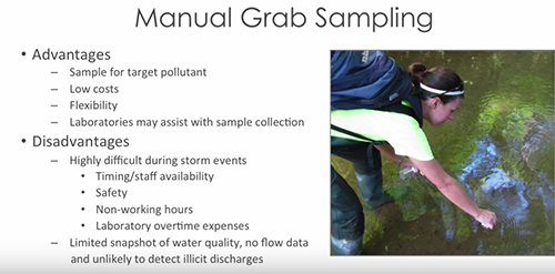
We did sort of a comparison to try to lay out the good and the bad. And so, you know, manual grab sampling I'm sure most on the call are very familiar with. And I think there will always be a place for manual grab sampling, and there's some real advantages. It's obviously low-cost, and we can sample for pretty much any pollutant we like, very flexible. We can get off this call and go sample in the creek behind the building if we need to. But there's also some inherent disadvantages, particularly if we're targeting storm events. For those that have done it, I know you can relate. But, you know, it never rains during normal working hours, and you're stuck dropping stuff in the middle of what you're doing, getting soaking wet, and it's very difficult, and people just don't kind of line up to do this. It's very challenging, and you see some of the other challenges there on the slide.
So with continuous monitoring it also has the good and the bad. The good, obviously, that you can get that highly detailed data, whatever frequency you really desire, and you don't have to be on site. There's a lot of things you can do with the data that you can't begin to think about doing with more of a snapshot grab sample. But certainly there's a cost there, and like anything, if you don't take care of the instrumentation, then the data's not going to be of real value. So just various things that we had to weigh there. But ultimately, the county decided, all things considered, to give the continuous approach a shot.
And it wasn't long after we started that it was very apparent to us that we really had something, that the sensor data was going to really, really help us. And so this is a slide that I like to use to sort of kind of illustrate that point that we used in discussion with the county. So you've got turbidity on the Y-axis, and you've got time on the X. And what I've actually done here is I've basically extracted some data points out of a continuous data set. But the point here is that, if you just handed me this slide and I didn't know anything else, but I saw these six samples over the course of about seven or eight hours, I would've immediately thought that whoever did this did a really great job, that they got data on the front end of this storm event. They got data on the back end, on the recession leg of the event. There's a clearly-defined peak, and it would appear to me that this data would be very representative of the storm event basically as a whole.
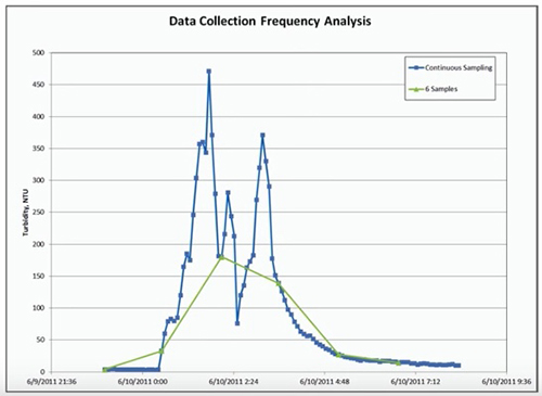
So now, I'm going to go to the next slide, and I'm going to have this same data in the background, but I'm going to show you the very same storm event and what the data would look like had they been collecting the data at 15-minute intervals. And keep in mind had they done this approach, this would've been a full day's worth of work. This wouldn't have been a walk in the park because there would've been continuous sampling and documentation, icing samples, chain of custody forms. This would've been an undertaking to get this amount of data over the course of one event.
So now let's go to the data every 15 minutes. So I think this slide, in general, is pretty self-explanatory. You know, unbeknownst to the person doing the grab sampling, the turbidity actually almost got up to 500 NTUs, as opposed to 175, so we would've missed the peak by almost a factor of two and a half. And furthermore, a lot of other pollutants tend to spike with changes in turbidity at the peak of a hydrograph. So not only would we have missed the concentration for turbidity, but other things. The flow was more than likely peaking somewhere around the same time. So any attempts to approximate the annual loading for this event would have just been extremely inaccurate. And unfortunately, this isn't the exception. This is really, by and large, the norm.
So because of some of the early successes and some of the things that we observed when we first started the project, the county's monitoring work has really grown, not just in the Reedy River watershed, but outside of the Reedy River watershed. So this a map of the current Greenville County Monitoring Network. And it might be a little hard to see some of this, but if you look at this sort of brown, kind of shaded polygon across from top to bottom on the slide, that's the Reedy River watershed. And everywhere you see the red dots are the county water quality stations, and the green triangles are the rain gauge network that we also operate and maintain on their behalf.
But the thing I wanted to point out here is that we intentionally installed these stations in series to allow us to segregate different portions of the overall watershed to look for hotspots and basically to try to sort of identify where the problem areas may lie. And you're going to see that reflected in some of the results in a later slide. But the other thing I wanted to point out here, if you note in the bottom right-hand corner, it's kind of hard to see, but there's a lake down there called Boyd Mill Pond. And this particular lake is one of two that's downstream of the county that's really kind of the linchpin behind this whole effort and the draft TMDL as it stands. So just kind of keep that in mind and we'll be coming back to that.
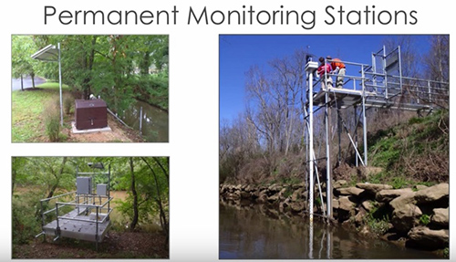
So the county's monitoring network and the stations, they really vary. It kind of depends on the location and how long they're intended to be in place. Some of the stations have nice aluminum platforms and walkways. Most of them, though, now are more like the one in the top left picture there, where we have similar components, but just kind of a bank-mounted installation. And these installations were done by YSI Integrated Systems & Services group out of Florida. They really do a great job for us. But what they all have here, they all have a stilling well, either PVC or aluminum, and all have the same electronics that I'm going to show you here on another slide.
In addition to having some of those things in common, all of the stations have the YSI Multiparameter Water Quality Data Sonde. And what I've got shown here is the parameters that we've used to date. Most of the stations have the same types of sensors on them, although we do have chlorophyll and a few others that are a little different from our river monitoring stations down in Boyd Mill Pond. Anyways, I'm also aware that there are other different types of sensors that YSI manufactures, so, Brandon, maybe you want to kind of chime in on that a little bit.
Brandon Smith, YSI, a Xylem brand: Sure, no problem. Thanks, James. You know, looking at the screen here, the first thing I'd say is, for those of you that are just thinking about getting into monitoring water quality continuously don't be too intimidated. If your particular project only requires a couple of these parameters, there's plenty of hardware options to accommodate for that. But you know, as James mentioned, there are all kinds of water quality sensors that you can plug into some of these sondes, and some of them aren't mentioned here on the screen. There are municipalities all across the world that are monitoring things like blue-green algae, for example. Toledo is a good example, Toledo, Ohio, where they've had a lot of outbreaks in Lake Erie, and they still draw water from that for their drinking water.
>>> Ask a Question
So I guess, my bigger point is, there's a lot of different parameters out there, and there's even more surrogate parameters that James will talk about a little later that uses the data from some of these more basic parameters alongside some particular algorithms and regressions to show you parameters that you didn't think you could measure, things like mercury, things like dissolved organic carbon, with some of the operable parameters you already have.
James: Okay, thanks, Brandon. When we first started our monitoring efforts, we were using exclusively the YSI 6-Series Sondes, so that is kind of one thing that has changed for us over time once the EXO sondes came out. We kind of had probably similar discussions that others have had and sort of debating whether or not to move to the newer sondes. But for us, we decided to go down that path, and it's really been a positive experience. We currently have around 20 overall, but I think 6 of the EXOs at this point that we're using in Greenville County.
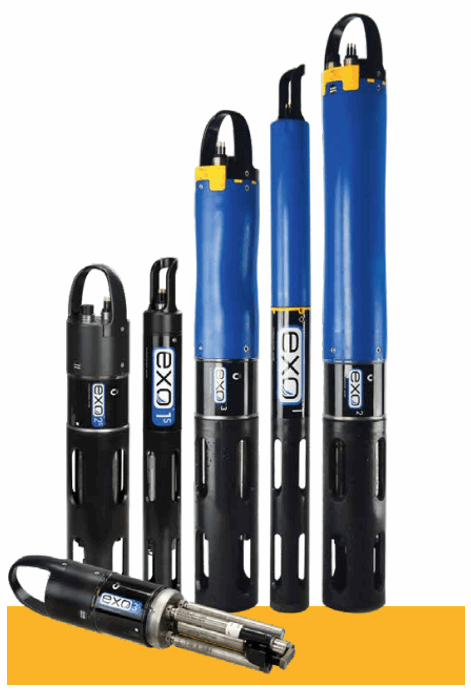 For us, the way that we do our calibration is we have been traditionally going into the field, retrieving the data sondes, and bringing them back to the office to do calibration. And so the fact that the EXOs now allow you to have sensors and the ability to replace them in the field has really been a huge benefit for us. Because now, with the replacement sensors, we're doing the calibration in the office and we're able to only have to go to the sites one time to replace sensors. So whereas we used to have two trips, now we have one. And so because it's taking us less time, it's a cost savings for the county, and we're also experiencing some savings on the calibration end of things. Our guys really like the fact that now they can use one bulkhead and calibrate, for example, six DO sensors at one time. It's sped up that process, which is also translating to less labor and a cost savings for Greenville County.
Furthermore, on the data side of things, where we used to have gaps in the data when we had the bulkheads out for calibration, we no longer have that. So it just gives us that much more confidence that we're really capturing anything and everything that's going on over the course of a year. And there's various other benefits. I've just listed a couple here, particularly the software. Our guys have really liked the new software associated with the EXO and, furthermore, some of the training that's offered through the EXO University. So Brandon, do you want to elaborate on some specifics there?
Brandon: Sure. Thank you, James. So kind of looking at this slide here, James is absolutely right. There's a huge amount of benefits to switching to newer technology. The 6-Series equipment from YSI has been a steadfast piece of equipment that's been in monitoring agencies' back pockets for the past 20 years. But throughout that time, we had a lot of lessons that we've learned on how to make these things more rugged, how to make them more intuitive for some of the pick-up and understand how to properly calibrate a sensor to make it as accurate as it can be to set it up for collecting this autonomous data to make sure that, at the end of a month-long deployment, when you open up the software and you're looking at the data, that you don't have gaps.
>>> Request Sonde Pricing
There are a couple of cons, of course, to using some of this hardware, which, first of all, it's expensive, and you don't buy these things because it's the less expensive option. You buy these sondes because you want continuous data, and you want to truly understand the dynamics of whatever ecosystem you're monitoring. The one thing that I always tell people about hardware purchases is you have to look past the upfront cost and you have to think about the long-term. Most of these projects are lasting well beyond one year. And even though that budget that you're looking at and looking at this upfront cost for this infrastructure to bill out, you have to think five years down the road. Is this going to hold up? Is the data that I'm collecting going to be relevant five years from now? And that means that you have to take a look at equipment that, at the beginning, might look a little bit more expensive, but it's going to hold up over time in some of those harsh environments and storm events that James mentioned.
(Side Note – Sensors can always be added at a later date as well. EXO sondes use smart sensors allowing you to add on at any time your budget allows.)
James: Okay, thanks, Brandon. So in addition to the sondes, we also use nitrate analyzers, and currently, with the county, we have three of these. These are manufactured by a company called EnviroTech, and it's basically kind of wet chemistry inside this enclosure. And it's very complex and it is maintenance-intensive. But at this point, we've got these things running well, and we are getting very good data to kind of complement the data collection that we're doing that I've already talked about.
But no matter whether we're talking about the rain gauges, the water quality stations, the nutrient analyzers, all of them are using the same data collection platform, like you see here. It's Campbell scientific data loggers, Sierra wireless modems, and you can see most of that in the picture here, and all of that data is then transmitted. We have cellular modems through alarms when they're needed, based on the programming that we put into these units, as well as to a server at our headquarters that allows us to then build customized websites like you see here.
So this is just one quick snapshot of the Greenville County website. And if you haven't ever seen continuous data, when you see it for the first time, it is just, in a word, it's eye-opening. To be able to see the daily variation in DO (dissolved oxygen), for example, due to photosynthesis and respiration, I mean, it's just really incredible. We can look for trends and correlation between different sensors. And then, from a practical standpoint, we can see maintenance needs as they occur, and we're able to address those and, by doing that, keep our continuous data, well…continuous. But one thing to keep in mind that this is more of a tool for us. This is raw data, and it gives us kind of a quick snapshot of what's going on. But we still have to go through a quality control and kind of data processing approach to get our final data. But from where we started, we've really come quite a long way with that process.
This is where we started, somewhere around, I don't know, seven or eight years ago. And we tried, in vain, early on to use Microsoft Excel, and we very, very quickly found the end of Excel, and we had a lot of struggles just viewing the data. Because the 15-minute data, if you do some quick math, you get over 30,000 data points for each pollutant for each station every year. So it becomes really kind of daunting to sort of wrap your brain around it and interpret it. So we realized very quickly that, while this was pretty neat, wallpapering our office with data, it definitely wasn't a good long-term solution for us. And it was at that point that we were introduced to Aquatic Informatics and the AQUARIUS Software, which has just really been a game changer for us, just has allowed us to do so much of that data, kind of fine-tuning to deliver really just a better, more reliable product for Greenville County. So Chris, you wanna step in here?
Chris Heyer, Aquatic Informatics: Yeah, James, absolutely. One of the things, first and foremost, AQUARIUS, from Aquatic Informatics, is a centralized data management system, and it really gives you that single source of truth for all of your data. Brandon talked about the importance of investing in a little bit more expensive hardware that's going to be a little more reliable and ensure that you have the highest quality of data. The same thing goes for the system that you're investing in to manage all of that data. Excel is great. Everybody on this call has done some really awesome things in Excel, but it's not a data management system.
And, you know, at the end of the day, all of these projects that are collecting data, I think it's easy to lose sight with all of the technology and all of the effort that goes into deploying the instruments and collecting the data. The thing that's most important at the end of the day are the data, and so you want a system that will allow you archive all of that data, access it really quickly, and then be able to provide the high level of quality shots and quality control on the data that you need to in order to ensure that you're producing the best quality data products at the end of the day.
And so, James, we've talked about a fair bit about this project. And I think, if I remember correctly, one of the things you mentioned to me was, for the county, this really resulted in some serious cost savings for them because you were able to do two things. You were able to reduce the amount of time that you're spending analyzing data, which in turn had a direct cost savings for them and less time billings. But also, you were able to provide a better data product at the end of the day that they could then use for better decision-making. Perhaps you can elaborate on that a little bit?
James: Yeah, absolutely. I mean, there's no doubt that there's been a cost savings, particularly from a labor standpoint because so much of the... Well, really the design of the software, I mean, it's for continuous data. And just being able to pan through the data sets and append data sets and zoom into the areas of interest and some of the tools that allow you to do kind of the global editing, it gives me more confidence, you know, that our QC is sound and that, ultimately, that we can rely on the data. And at the same time, it's certainly allowed us to do that and go through that process much quicker.
Chris: Yeah, that's fabulous. And I know that, obviously, the county has had some very, very good things that have come out of it in terms of cost savings.
James: Yeah, absolutely. And then just another screenshot here. In addition to using it for its water quality features and functionality, we're also using the rating development toolbox, and that's been a great tool for us to manage our discharge measurements, to do rating curve shifts, and just really stay on top of our discharge measurements and our rating curves, which, of course, is integral to some of the things we're trying to do with approximating loadings.
So if you've been paying attention along the way, though, so we've got our water quality data coming in, our good raw data, we've got our QC process. But what we hadn't talked about yet is the fact that, while we have this great sensor and indicator data, this draft TMDL was for nutrients, so we had to find a way to basically kind of bridge the gap from the sensor data to the pollutants that we were more interested in.
So what we've done is we've used a regression approach, where we're basically pairing grab sample data that we've collected in the field with continuous data, you know, basically matched up the time stamps to look for relationship between those variables. And we've actually had a lot of success, although the relationships are very site-specific, we've had a lot of success building some of these relationships for nutrients. And so by, then, having equations that we can count on to approximate some of these parameters, it allows us to then approximate these values at the same frequency that we collect our sensor data, and so that's been huge for us. And I don't have time to offer a lot of examples, but it's been integral to basically our approach.
Chris: Yeah, James. I just want to chime in here that one of the great things about the AQUARIUS server that you have, that you've been able to do is, once you've built up that regression, you're able to apply that to a calculated drive time-series. So that as your real-time data comes into the system of the parameters you're measuring in real time, that regression is running in the background and creating that calculated drive time-series in real time, so you can get that predicted nitrate value or the predicted phosphorus value, whatever it may be. So, you know, the power of that for you guys must just be invaluable as you're trying to look at potential loadings and follow what these loadings are doing after a storm event and seeing in real time those calculated values.
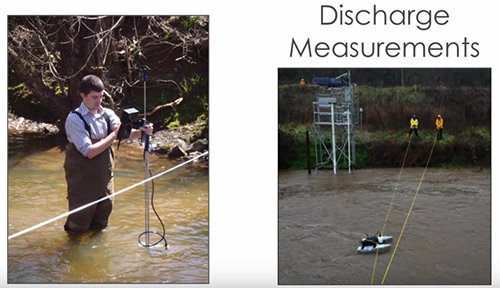
James: Yeah, that's a good point. It definitely does. Well, so I've talked a lot about water quality. This is the process to get that component of these loads. However, what people often lose sight of with a TMDL load, the L, by definition, stands for load, so we also have to do a really good job on the flows and the volumes. So, in addition to our water quality efforts, we also do discharge measurements. We follow the USGS procedures. They have a lot of great references out there, technical references, for how to do this the right way. And this a couple of pictures of our guys doing some low-flow wading measurements. We use the SonTek, a Xylem brand products here. This is the FlowTracker on the left. And then, on the right, it's one of the older acoustic Doppler pontoon-mounted systems, but this one was called the RiverCAT. We also use the RiverSurveyor S5, but we go out at different stages and measure flows. And so once we then have a reliable rating curve at our stations coupled with reliable regression equations, well, that's really sort of where the fun begins.
So, at that point, we can evaluate and calculate nutrient loads. So in the image that you see in front of you now, I've got two different maps. The one on the left is for phosphorus, the one on the right is for nitrogen. The different colors, all of those are sub-watersheds on the Reedy River that drain to each of our monitoring stations, and they're color-coded. It's kind of like a heat map based on, basically, their annual nutrient yield. And the thing to keep in mind here is you've probably seen plenty of images like this in the past, but they're almost always based on model results. And while models are very important and integral to this type of work, models inherently have many, many, many assumptions. You have to assume certain design storms and rainfall amounts. You have to assume a certain amount of antecedent moisture.
You have to figure out your wash-off and your pollutant yields. And then how do those pollutants...you know, do they decay as they move downstream? Whereas what I'm showing you here is based on field-measured data, field-measured flow, and field-measured water quality, and therefore, it's our belief that our load estimates at these stations are just highly valuable. And it's very valuable from the county's perspective because, not only does this help us maybe improve the TMDL model, but it helps us steer the BMP implementation. Because now, instead of some kind of shotgun blast of BMPs across this watershed, we can sorta steer the program and make sure that the resources are being spent in the right places and on the right sources. We can approach the right entities and, again, just if we're going to spend the money, to spend it in the right places.
In addition to the loads, we do all sorts of statistical analysis to really try to get as much out of the data as we can, everything from box-and-whisker plots to cumulative distributions, my current favorite, the raster plots we've been doing, that actually allows us to view each and every data point over the course of a year. And the point of this slide is just to say that you should really try to fully leverage continuous data because there's so much there that, when I talk to people that even have mature monitoring networks, that they're not fully getting everything they could out of the data. There's applications in other departments and other entities in your area, so I would just encourage people to really, really try to explore that.
Okay, so if you remember from one of those earlier images, I pointed out Boyd Mill Pond, which is just south of Greenville County. Boyd Mill Pond is really kind of driving this TMDL, and the reason for that is because, in the state of South Carolina, we don't have nutrient standards for flowing waters, only within our lakes. And so the state has a monthly grab sampling program in the lakes, and that's where the exceedances for nutrients have taken place. So that's where the TMDL is being implemented and what it's based on and where it'll be enforced. In addition to Boyd Mill Pond, there's another downstream lake that's further down, and it's been our contention and the county's that the county may be having a small impact on this lake, although I do think it's fairly minimal, but we really don't think the county and some of the other entities in the northern part of the watershed are affecting the lake downstream.
So if you look at this picture here, this is actually a picture of the dam. And it's kind of hard to tell the scale here, but the dam itself is about 30 feet tall. And having gone out and seen the dam and spent some time on the lake, you can see the sedimentation that's going on in the headwaters, not unlike any other lake. And so it's our belief that a lot of the sediment and pollutants that might be attached aren't getting through the lake, and this is, again, important from the county's perspective. So because of the success that the county had had with the river monitoring program and because the state doesn't have the resources to do more in Boyd Mill Pond, the county decided, "You know what? We're going to try to figure this out ourselves." And so in the last year, we've now deployed buoys into Boyd Mill Pond.
So if you look at the lake here, each of the yellow stars is a buoy. So the river comes in at the top of this image and then turns into the lake, we've got a second station about halfway down the lake, a second buoy, and then toward the bottom, the last star, that's a YSI Vertical Profiler, all of which I'm going to show some pictures in a minute. But the idea here was to, again, assess whether things were able to move through the lake. And then, furthermore, if we had some in-lake processes or some local maybe failing septic tank drain fields, you know, basically, what is the root of the nutrient problem, and is it really from upstream sources?
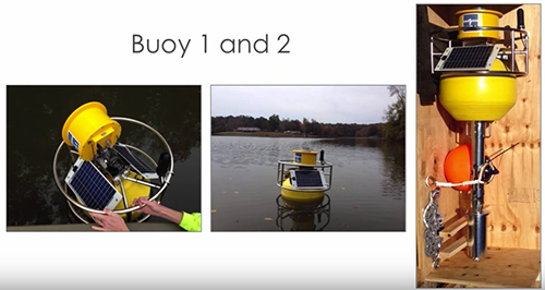
So this is just a picture of the first two buoys, and they're probably not unlike you might have thought in your head when I mentioned the term buoy. But you can kind of see here that they basically have a hatch that you opened up, you deploy your sonde down inside the stilling well there, and it has the same modem and data logger that we use on our river stations. This next picture is actually a picture of the vertical profiler, and this is just, well, really, really neat. The picture on the left is the profiler in its entirety. It's right near the dam of the lake, and you can hopefully see there in the middle picture that yellow housing opens up. It has a motor assembly inside, and the motor actually raises and lowers a data sonde up and down through the water column at a frequency that we dictate, and we take readings every meter. Brandon, what all have I left out on this?
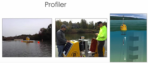
Brandon: What I would add and even just to a much more general topic is we're talking about buoy systems, but in reality, we're really talking about, where do we put the sonde? Where is the best place to put a sonde in this pond or in this watershed to make sure we're getting representative data from what we want to accomplish? So whether it's a more stationary buoy like what's on the last slide or it's one of these vertical profilers that are a little bit more high-tech, that's what we're getting at here is how do we deploy these sensors in the right place at the right time? And when we talk about vertical profilers here, James is right. This is a sophisticated buoy system that's lowering a sonde through the water column, bringing it back up, and taking measurements at discreet points along the way. So that kind of rich information is almost impossible to get manually, so you have to do it continuously.
And for those of you that are thinking about, you know, "How am I going to deploy one of these instruments in my county and in my area?" But you also have to think about, is the data that you need at the surface or is it deeper than that? And that'll drive your decision-making on, "How do I deploy this instrument? Is it a profiling system?" Maybe. It has to make sense for you. But the power of the profiler is that you're going to be able to get a really rich 3D baseline of data, and you'll be able to see over the course of an entire year, a couple of years, you know, what seasonality looks like, what turnover looks like in whatever this water body is. And in these systems, it's even more powerful in that you can also add met sensors, understand, you know, what's the wind speed, what's the rainfall measurements, and how does that impact the data that I'm collecting as well? So when you look at one of these more complicated systems, it's all about a comprehensive view of what's going in that ecosystem.
James: Okay, so this graph is just to show you an example of some of the data. And we've been using these now for a year, so I don't have a lot of conclusions that are firm to offer. But what we have seen here, this is a graph with turbidity on the Y-axis and the data from all three buoys as shown here with time on the X-axis. So the pinkish-colored line with the biggest spike, that is the most upstream buoy, the blue or kind of purple-looking color is the second buoy, and the brown line at the bottom is at the dam at the profiler. So we have a little noise in one of the...it looks like the blue data set on some of the points there. But what you can see very clearly with Buoy 1 is this extreme spike in turbidity when we got a rain event, and the turbidity went up over about 100 NTUs. There's definitely a lag as that water moves through the lake system, but you can hopefully kind of see there that Buoy 2, we only had a peak after that large one of about 20 NTUs and then a much more muted concentration of turbidity leaving the dam. And so this has just really kind of further validated what we observed firsthand, and, again, we think it's going to be really, really important for the county.
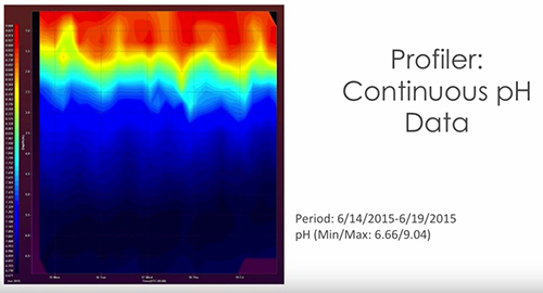
The next image is really another one of my favorites. This is one of the features that's also part of AQUARIUS. And so what you're seeing here is data from the surface to the bottom of the lake at the location of the vertical profiler. So the top of the plot is the water surface, and then moving down in depth, and this is in meters, you can see data from top to bottom. If you look at the X-axis, you're looking at a period of...it looks like about five days, and the difference in color is the range in pH over this particular period. So you've got a range of around a pH of nine at the surface, and they've been really elevated this summer due to biological activity, to almost down as low as six and a half near the bottom of the lake. But it's just been really, really powerful to be able to see, you know, that just really significant fluctuation from top to bottom, and we've seen stratification like that for a number of pollutants. And to Brandon's point, one of the reasons we're doing this is to see if we do see some turnover when the temperatures change. But Chris, did you want to add some other comments to this?
Chris: I think the only thing I would add is what you don't see here is...you're seeing a snapshot of what we call our Profiling toolbox, which allows you to do 3D visualizations, and there's a variety of visualizations that you can do. But you also have the ability to look at all of your time-series at a single depth or for a single time-series all of your depths. And so the tool gives you flexibility to not only produce pretty pictures, but also go a little bit more in-depth in viewing data across that entire three-dimensional profile and looking at it in more detail. So that visualization capability is really quite powerful in trying to get your head around what's going on in the system.
James: What does all this mean for Greenville County, and what are kind of the overarching benefits? So I've tried to sort of summarize that here with kind of a look at return on investment. And the biggie is just that we believe we've been able to truly define baseline conditions on the river, and we're trying to now take it a step further to really start looking into, you know, contributions from individual stakeholders. But we think, based on what we've seen to date, that the county is not the contributor that many believe and that we have data now to really make improvements on this TMDL model. And, I guess, most importantly, for Greenville County and some of the other stakeholders in the watershed is that the TMDL has currently been tabled, and EPA Region 4 has been really supportive of an alternative to the TMDL. And so we're currently working in tandem with a number of entities on a 5R Watershed Plan.
The 5R is a pilot initiative from Region 4. It's somewhat similar to a 4B, if you're familiar with that, as a TMDL alternative. But, you know, when we first started...and the three main partners are highlighted here at the top, Greenville County, the City of Greenville, and Renewable Water Resources, who is a large wastewater utility provider in the area. And when they first started in working with the regulators, there was a lot of skepticism really on all sides on kind of coming together and trying to work collaboratively to solve this problem. But what actually really pushed this forward was the county's commitment on the monitoring network. I think it illustrated to all of the stakeholders and the regulators, too, maybe most importantly to the regulators, that the county wasn't kind of thumbing their nose at them as far as the TMDL. It was just simply that they wanted to get it right, that they wanted to get data that everybody could count on to get the best model that they could.
So those three partners have worked together really hard and brought together this past spring. You can see there on the left a group of about 25 stakeholders. We now have a very formalized structure. You can see here about six different sub-committees, an executive committee here. But it's been really interesting to see how the data from the monitoring network has really kind of touched each of these groups, and it's going to be really integral to the whole thing as we move forward. And again, at the end of the day you go back to that price tag that I showed you earlier in the presentation, and we think that this overall effort is really going to save the county and probably some other stakeholders considerably on the implementation end of the TMDL process.
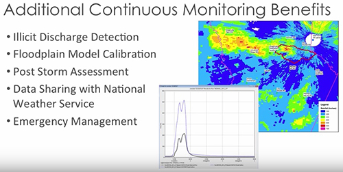
Last, but not least, there's also other benefits of the continuous monitoring data, I mentioned that briefly earlier. But just things to think about, if you're considering trying to start out doing some continuous monitoring, there are sharing opportunities. There are other departments in your organization that could probably use some of this data for other things, and there's other partners, you know, neighbors. These are just a short list of some of the other uses that we've found for continuous data with Greenville County and also a few of our other clients.
A couple acknowledgements. You know, first, I really want to thank Greenville County. Greenville County, particularly Paula Gucker and Judy Wortkoetter, are my primary points of contact. Just their vision and their willingness to embrace new technology has been a lot of fun, and at the end of the day, I believe it's going to save the county a lot of money. And certainly also our Woolpert team. You know, I'm sitting here talking on the webinar, but the names that I have listed here, these are the folks in the trenches, you know, doing the lion's share of the work and they just do a tremendous job.
And one thing I did want to mention, too, is that this group, our team, has a really wide range of skill sets, and I think that's really important as you design and set up your own monitoring network efforts. Because you need that guy that's really handy in the field, but you also need those people that are really good and attentive in the lab. But if you don't have people that can also process and analyze the data and do the statistics, you're not going to realize the full benefit, either. So I would encourage people to kind of keep that in mind as you set up your own monitoring programs. And with that, I'll kind of kick things back to you, guys.
Chris: Thanks, James. I really appreciate it. That was a fantastic webinar. It's just really impactful to look at what the county was faced with in terms of BMP implementation and the cost that it was going to result in for them and what they've been able to save by embarking on this project is really a phenomenal story. But I think one of the things that sort of maybe didn't get portrayed in the messaging is that it's not only about saving the county money, but it's also about making sure that the improvements that are being asked to be put in place as a result of the TMDL process, the BMP improvements, watershed improvements, that they're really put in the right place so they actually have an impact.
So let's just assume for a moment that the county had decided not to engage with Woolpert to do this monitoring work and to do the analysis and to determine that these improvements wouldn't have an impact and they had actually gone ahead and spent this money to put these improvements in place, the end result is that the total daily load would not have been reduced at all. There still would've been watershed impairments. And so I think this process is extremely important for a variety of reasons, and saving money is a big one. But another big one is making sure that the improvements are put in the right place. So the story for me just really resonates. I think it was just a fantastic example of how continuous monitoring data coupled with a great centralized data management system and analytical tools to really understand what those data are telling you can have hugely impactful results.

Additional Blog Posts of Interest
Is a Vertical Water Quality Profiler Right For You?
7 Tips to Fight Fouling and Extend Sonde Deployments | Tip #1
The Evolution of Water Quality Monitoring [Free eBook]
Oregon's Tualatin River: America's Early TMDL Case Study